Colour, an inclusive visual language for climate communication

With ongoing climate change and the growing global impact of environmental issues, effective climate communication has become increasingly important. This project investigates how climate knowledge can be shared openly and equitably by focusing on three key trajectories: (1) designing simple and accessible visualisations to communicate environmental flux data, ensuring accessibility for populations disproportionately impacted by the climate crisis; (2) considering colour-vision accessibility and cross-cultural clarity; and (3) ensuring the sustained comprehensibility and lasting relevance of visual designs. Through these efforts,this project aims to improve public understanding of climate data and support more inclusive and sustainable climate communication.

At two public events, the Sustainable University Day 2024 and the School of Commons Gathering 2025, we collected design feedback from participants in fields ranging from marketing and arts to waste management and sustainability.

This project focuses on how to effectively visualise environmental science data through colours for climate communication, in a shared open and equitable manner. Thus, our primary objective is to use colour visualization to make climate information as clear, simple, and accessible as possible, with the focus on helping the groups most affected by the climate crisis to understand it and overcome the barriers they face. The project follows three research trajectories.

1. Colour is closely linked to human emotion.

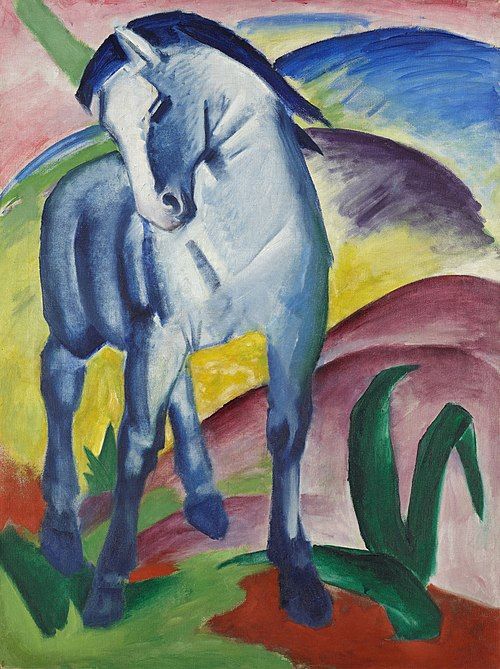
As an integral aspect of both natural and constructed environments, colour carries aesthetic appeal, with certain colours being perceived as more pleasant than others. Further research shows that humans systematically and reliably associate colours with emotions (Jonauskaite et al., 2025). Precisely because colour possesses this power to transcend language and access perception and emotion directly, this project employs colour as the core element to design visual tools that move beyond the limitations of text and graphs. This approach aims to break through the traditional barriers of climate communication, trigger emotional responses, and thereby deepen public engagement with climate issues.

2. Inclusive dialogue through colour.

An inclusive engagement must specifically prioritise communities most vulnerable to the climate crisis, as its impacts disproportionately affect marginalised groups. Their vulnerability stems from intersecting factors such as geographic location, financial and socio-economic status, cultural and social conditions, limited access to resources and services, and restricted decision-making power (World Bank, 2025). Therefore, effective design must overcome these very barriers. As noted by the Chinese writer Bi Feiyu, color constitutes a form of social equality in the world of the sighted (Bi, 2016). It serves as a foundational, low-barrier visual language that can transcend socio-economic divides, making it an ideal medium to initiate inclusive dialogue and co-design processes.

3. From perceptual equality to universal access: designing beyond sight

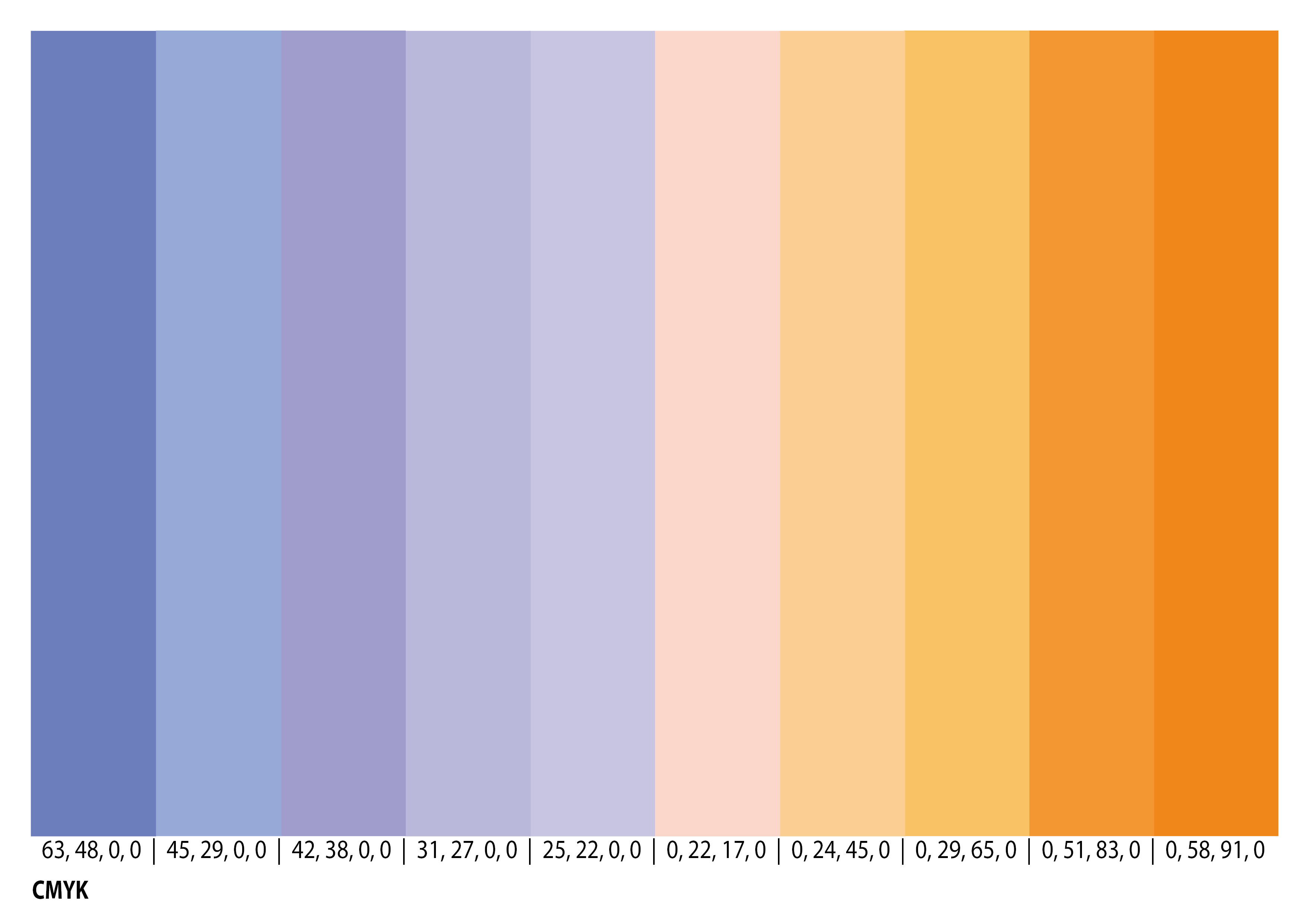
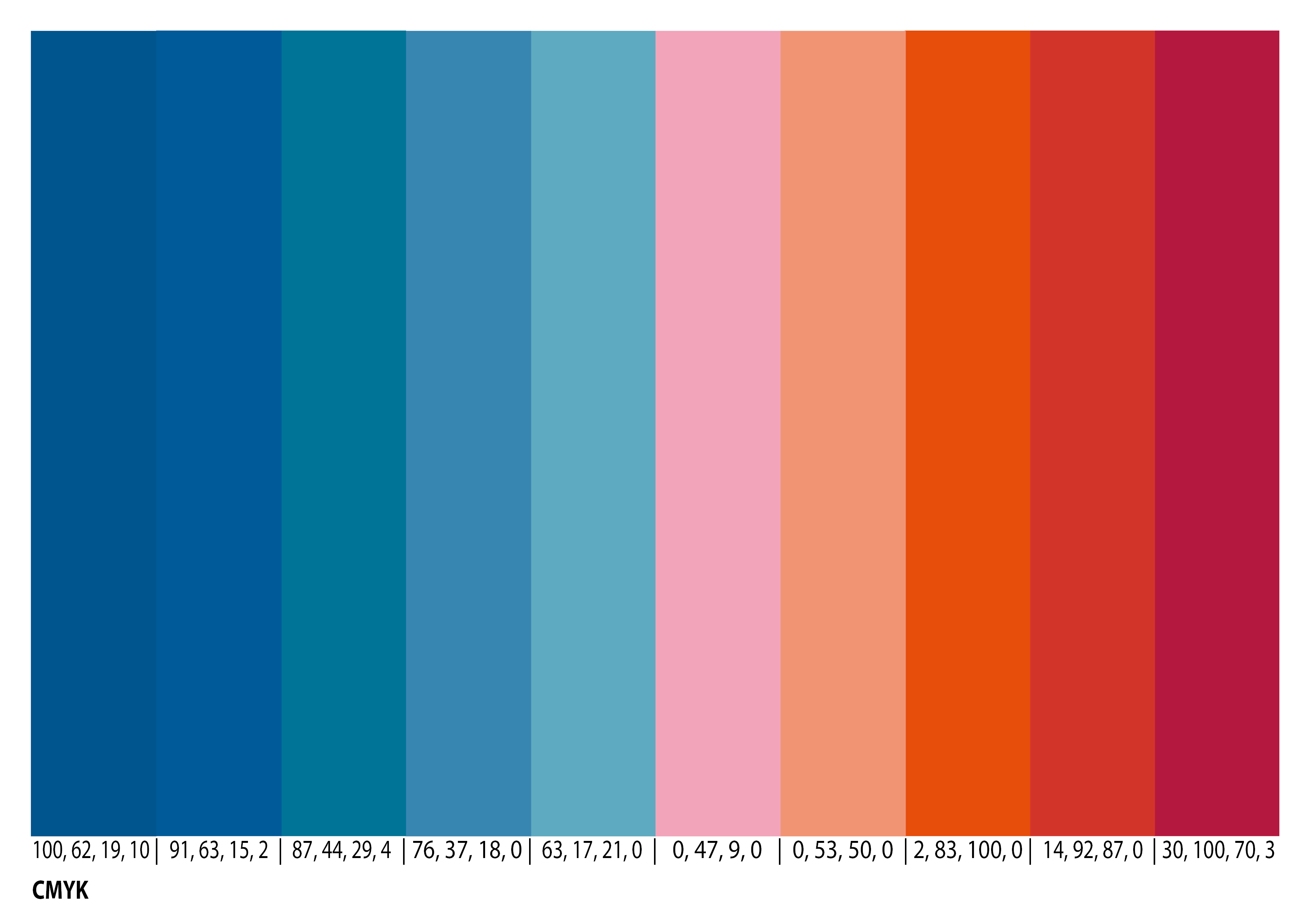
If colour is to serve as a truly equitable medium for inclusive dialogue, then the design must actively extend its principles of accessibility to include those with diverse visual abilities. This commitment to universal access necessitates translating the concept of inclusion into concrete, physiological design standards. Therefore, all colours in our visual system were selected and tested to be clearly distinguishable for individuals with common forms of colour vision deficiency, such as red-green or tritanopia colour blindness. Furthermore, to ensure the system's reliability and broad utility across both digital and physical mediums, CMYK colour codes were strictly specified for all selections. This guarantees consistent reproduction in print and facilitates the wider adoption of the visual system.

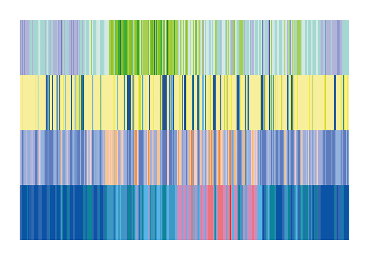
Methodology: translating flux data into an accessible visual language.

The scientists of the ETH Zürich Grassland Sciences Group have done excellent work in measuring fluxes, directly and continuously quantifying the net exchange of CO₂ between terrestrial ecosystems and the atmosphere using the eddy covariance technique, amassing rich long-term datasets. In addition, meteorological data like air temperature, precipitation and the dryness of air (vapor pressure deficit, VPD) was measured in parallel, since these climate variables are considered important drivers of the CO₂ flux.. Now, our core challenge is to select colours that can transform vast, abstract flux data into visuals which the public can grasp and connect with. This involves a deliberate choice of colours based on three key criteria: i) their accessibility for colour-blind viewers, ii) their inherent emotional resonance, and iii) their ability to convey meaning across cultural barriers. Guided by these criteria, our final approach is to visualise each CO₂ flux or climate variable using a pair of contrasting hues to represent an opposing process or condition.

Fig. 1 Colour codes for the data visualisation of net ecosystem CO₂ exchange (NEE). Colour codes are expressed in CMYK to ensure consistency in print.

Green and violet hues represent CO₂ uptake and release, respectively (Fig. 1). Green was chosen to represent CO₂ uptake, inspired by photosynthesis, the process in which plants use sunlight to convert CO₂ and water into oxygen and organic compounds.

In winter, when leaves fall and carbon fixation decreases, violet was selected to represent the predominant ongoing release of CO₂. This choice draws direct inspiration from the subtle violet hues in Claude Monet’s Lavacourt under Snow (ca. 1878–1881), which masterfully captured the cold, reflective quality of a snow-covered landscape -a season of heightened atmospheric CO₂. This artistic observation is grounded in historical climate reality: the painting likely depicts the exceptionally cold winter of 1879/80 (The National Gallery, 2024). Thus, Monet’s violet palette does more than capture a visual mood; it documents a specific climatic condition that directly correlates with the season of ecosystem dormancy and sustained CO₂ release that our data depicts.

Fig. 2: Claude Monet, Lavacourt under Snow (ca. 1878–1881). Image source: Wikimedia Commons.

The combination of green and violet is not only visually striking but also deeply rooted in cultural history, which lends it profound narrative power for communication. This duality is powerfully exemplified in two iconic works. In Sir John Everett Millais’s Ophelia (1851–52), violet functions on multiple levels: realistically in the shadows of her silver-embroidered dress, and symbolically in the ring of violets around her neck -a traditional emblem of faithfulness, chastity, and death (Easby, Harris, & Zucker, 2025). Enveloped by a profusion of meticulously rendered green plants, her drowned figure embodies a rebellion against Shakespearean gender norms (Kottas et al., 2018), visually intertwining her fate with the natural world that both surrounds and claims her. Similarly, the witch in Disney’s Sleeping Beauty wields her power cloaked in purple, casting spells amidst roaring green flames, a visual code that explicitly links the colour pair to potent, transgressive agency.

Fig. 3: Sir John Everett Millais, Ophelia (ca. 1851–52). Image source: Wikimedia Commons.

Fig. 4: Marc Davis, Sleeping beauty (1959). Image source: Wikimedia Commons.

From an ecofeminist perspective, such recurring imagery critically intertwines the destinies of women and nature, framing both as entities often silenced, exploited, or deemed “hysterical” within patriarchal frameworks (Kottas et al., 2018; Priyadarshini, 2025). By consciously adopting this historically and symbolically charged colour pair (green/violet) to depict the natural carbon cycle (uptake/release), our visualisation intentionally echoes and repurposes these deeper cultural narratives. It invites viewers to see beyond abstract data points, connecting the essential fluxes of ecosystems to broader, more resonant themes of life, dormancy, resilience, and the urgent need for attentive care.

Fig. 5 Colour codes for the data visualisation of precipitation. Colour codes are expressed in CMYK to ensure consistency in print.

The yellow to Prussian-blue gradient (Fig. 5) indicates an increase in daily rainfall. Blue, first used around 2600 BCE (Muntwyler, 2022, p. 243), has long represented water, the sky, and the ocean across cultures, making it an intuitive representation of precipitation. Beyond this universal symbolism, blue accrued deeper layers of meaning in modern cultural contexts, acquiring utopian and spiritual connotations. Particularly from Romanticism onward, in response to anxieties about rationalist domination and a loss of individuality at the dawn of the Industrial Revolution, blue -as the colour of sky, ocean, and fluidity -became a key reference for expressing immaterial ideals. This tradition, extending from the Expressionist group Der Blaue Reiter (1911) to Bertolt Brecht’s ironic “blue moon” in “Memory of Marie A” (1927), persisted throughout the nineteenth and twentieth centuries (Doran, 2013, p. 9).

Fig. 6: Franz Marc, Blaues Pferd I (1911). Image source: Wikimedia Commons.

This conceptual grounding of blue is further reinforced by its fundamental opposition to yellow within colour theory. In Goethe’s framework, yellow and blue are positioned as the lightest and darkest poles of the spectrum, forming a primary dialectical pair. He theorised that colour emerges from the resolved tension between light and darkness, with yellow representing light tempered by darkness. This polar relationship generates visual and conceptual intensification inherent to nature's principle of polarity and visualised in the colour circle, where opposites like blue and yellow “reciprocally evoke each other in the eye.” (Doran, 2013, p. 8).

Such opposition extends beyond theory, anchoring itself within the respective art histories of both colours. Yellow ochre, classified among the naturally occurring "earth colours" derived from materials such as iron-oxide clays (Winsor & Newton), is one of humanity's oldest pigments—used in rock art, pottery, wall paintings, cave art, and tattoos dating back to 300,000 BC (Hirst, 2019). It is no accident that since the 2nd century BCE, yellow has been the most revered colour in China, representing “earth” -an element esteemed for its vastness and its capacity to nurture and sustain all life (Chen, 2015, p. 76).

Interestingly, yellow’s symbolic potency in the West mirrors this complexity through its inherent duality. Historically, it has been the colour of light, illumination, enlightenment, and gold (absolute value), yet equally the colour of death, decay, and excrement (a figure of negativity) (Doran, 2013, p. 8). Thus, unlike the binary opposition of black and white, yellow contains contradiction within itself -a point articulated by Goethe in his Theory of Colours (1810).

Therefore, the yellow-blue gradient in our visualisation is justified not only by its immediate intuitive reading (earth/aridity to water) and its grounding in colour theory, but also by the rich, dialectical -and often internally conflicted -cultural narratives that each hue carries, together forming a sophisticated and resonant semantic pair for communicating environmental change.

Fig. 7 Colour codes for the data visualisation of vapour pressure deficit (VPD). Colour codes are expressed in CMYK to ensure consistency in print.

Periwinkle and orange hues represent the transition from low to high vapour pressure deficit (VPD), linked to a shift from high to low relative humidity (Fig. 7). While VPD is linked to precipitation, it also increases with temperature. Orange was selected for high VPD (i.e., low relative humidity) both because it approximates the colours associated with low precipitation (yellow) and high temperature (red), and to ensure clear differentiation among environmental variables. Furthermore, orange and periwinkle are among the most common flower colours in nature; this contrasting pair was specifically chosen to avoid colour-blind confusion. Orange tones in plants arise from carotenoid reflection, while blue to violet tones result primarily from anthocyanins (Welsch, 2004, p. 243). We believe that the deep-seated cognitive associations forged through prolonged interaction with nature can instinctively evoke positive emotional responses.

Image source: Wikimedia Commons.

Image source: Wikimedia Commons.

Blue and red hues represent air temperature from low to high(Fig. 10). This design follows the Warming Stripes (2018) format developed by the British climatologist Ed Hawkins (Smith College, 2023), which has gained wide recognition and adoption due to its intuitive effectiveness. Our design decision was to retain its core blue-red color contrast to maintain visual logic and avoid cognitive confusion, while adjusting the specific hues to create a visual distinction.

Respondents gave positive feedback on the clarity and relevance of our design.

Through questionnaires at two public events, we collected feedback on our three explanatory posters and design materials from artists, scientists, and non-expert visitors, attending the Sustainable University Day 2024 and the School of Commons Gathering 2025.

At the Sustainable University Day on November 2024, all respondents indicated that the colours not only captured their attention more quickly but also made the corresponding scientific data easier to understand. Moreover, 95% found the colour combinations sufficiently distinguishable (n = 21).

Based on 17 valid questionnaires collected at the School of Commons Gathering on 3 July 2025, 77% of respondents found the colour combinations appealing (n = 17); 82% reported no difficulty distinguishing the colours; 53% considered the colour combinations consistent with general cultural understanding; and 71% indicated increased curiosity about ecosystem responses to environmental change after viewing the poster presentation.

The positive responses gave us confidence to use this design in place of complex scientific language for climate communication. We also created postcards as gifts for the participants of the 2025 School of Commons community and for the scientists attending the eLTER 2025 Science Conference (European Long-Term Ecological Research). We hope that, through sharing, this visual language for climate communication will reach and be used by many more people.

Fig. 10 Colour codes for the data visualisation of air temperature. Colour codes are expressed in CMYK to ensure consistency in print.

The postcard depicts the fluxes and climate variables of the Swiss spruce forest in Davos during2020, located at an elevation of 1639 meters.

Conclusions

Returning to the project's initial goal—how to share climate knowledge openly and equitably—our design offers an answer centered on visual inclusivity. Proceeding along the colour theory, art-historical lineage, and practical accessibility, we have constructed not merely a set of scientific data visualizations, but a narrative tool capable of triggering emotional connection and cultural resonance.

Feedback collected from two public events indicates that this design does enhance comprehension, spark curiosity, and demonstrate cultural inclusivity. While the initial feedback is positive, its long-term efficacy and applicability across diverse contexts require further evaluation and iteration. We look forward to collaborating with a broader community of science communicators, designers, and communities to refine and promote this visual language, ensuring it truly serves those most in need of understanding climate information, yet who are often excluded from the conversation.

References

Bi, F. (2016). The massage (H. Goldblatt & S. L. Lin, Trans.). Penguin Books. (Original work published 2008)

Chen, Y. .-Q. (2015). 观念之色:中国传统色彩研究 [The colour of ideas: A study of traditional Chinese colours]. Beijing: Peking University Press.

Doran, S. (2013). The culture of yellow, or, The visual politics of late modernity. Bloomsbury Academic.

Easby, R. J., Harris, B., & Zucker, S. (2025, February 7). Sir John Everett Millais, Ophelia. Smarthistory. https://smarthistory.org/millais-ophelia/

Goethe, J. W. von. (2006). Theory of colours. MIT Press. (Original work published 1810).

Hirst, K. K. (2019). Ochre: The oldest known natural pigment. ThoughtCo. Retrieved January 19, 2026, from https://www.thoughtco.com/ochre-the-oldest-known-natural-pigment-172032

Jonauskaite, D., & Mohr, C. (2025). Do we feel colours? A systematic review of 128 years of psychological research linking colours and emotions. Psychonomic Bulletin & Review, 32(4), 1457–1486. https://doi.org/10.3758/s13423-024-02615-z

Kottas, G., Peters, W., Olson, R., Harrison, N., Emeny-Smith, N., & Hanlock, J. (2018,

November 19). Gender in Hamlet. https://hamletgenderstudy.home.blog/

Muntwyler, S. (2022). Das Farbenbuch [The book of colours]. Alata Verlag.

Priyadarshini, K. (2025). Ecofeminism. International Journal of Creative Research Thoughts, 13(1). https://ijcrt.org/papers/IJCRT2501365.pdf

The National Gallery. (n.d.). Claude Monet: Lavacourt under Snow [Painting description; notes on historical weather context]. Retrieved May 17, 2024, from https://www.nationalgallery.org.uk/paintings/claude-monet-lavacourt-under-snow

Welsch, N. (2004). Farben: Natur – Technik – Kunst [Colours: Nature – Technology – Art] (2nd ed.). Spektrum Akademischer Verlag.

Winsor & Newton. (n.d.). Colour story: Sienna. Retrieved January 19, 2026, from https://eu.winsornewton.com/en-row/blogs/articles/sienna?country=HK

World Bank. (2025, October 7). Social dimensions of climate change. https://www.worldbank.org/en/topic/social-dimensions-of-climate-change

Smith College. (2023, June 12). Warming Stripes (2018) by Ed Hawkins. Climate in Arts. https://www.science.smith.edu/climatelit/warming-stripes/

Yue Wu

I am a visual artist and artistic researcher committed to equitable knowledge production.

Liliana Scapucci

Liliana is a post-doctoral researcher with an interdisciplinary background in ecology, atmospheric science, and ecosystem management, which was developed thanks to an international education setting in Italy, Portugal, Denmark, and Switzerland.

Nina Buchmann